Mooshak, the social platform for India.
Product and Visual Design
//
Agrahyah
Introduction
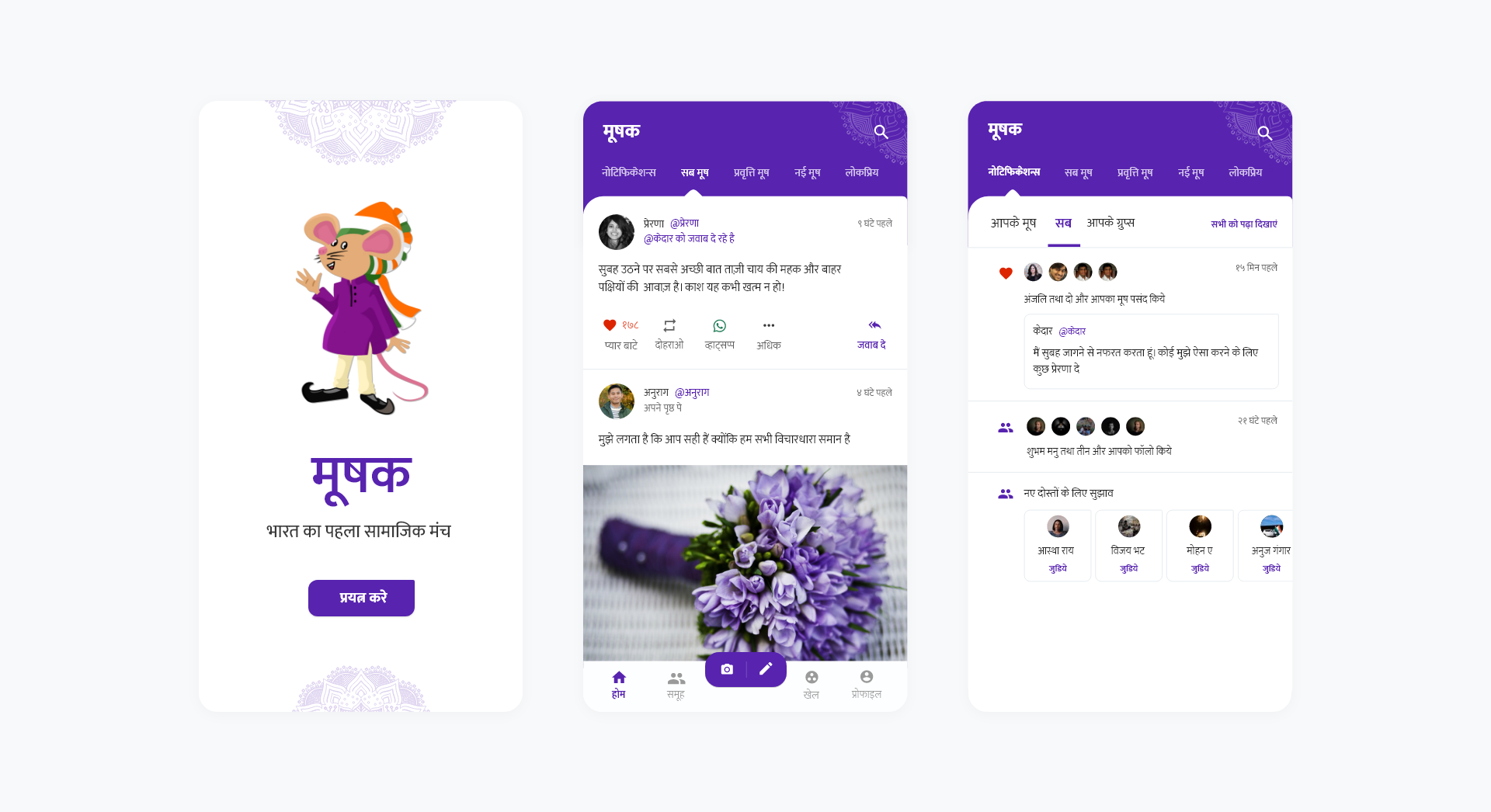
Mooshak was created as a social platform for India, targeted at the Hindi speaking audience in the country. Built from the ground up with a vernacular audience in mind, every tiny aspect of the app was designed keeping in mind that everything we knew and assumed about conventional design had to be foregone.
My Role
As part of the design team at Agrahyah, I led the brand, visual and experience refresh, and undertook the redesign at the grassroots of the product ideology - connecting भारत, rather than India.
User Value
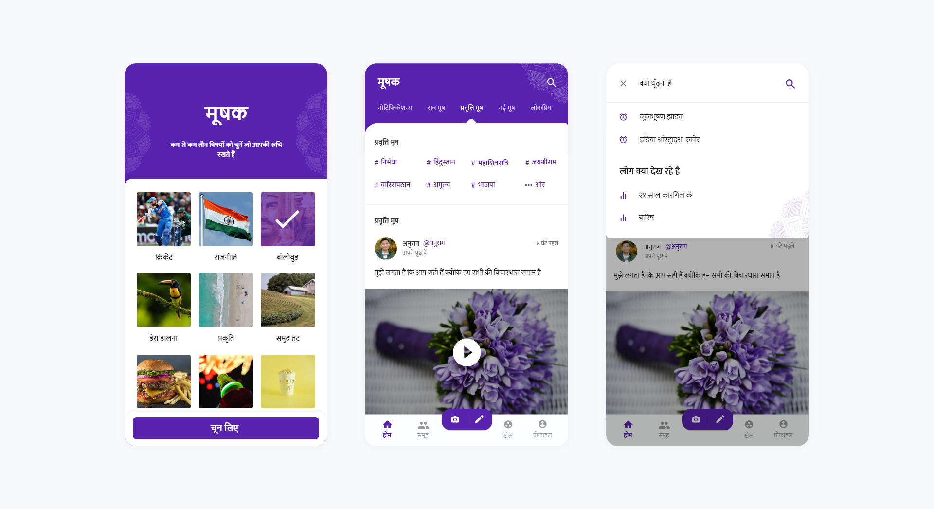
Mooshak was built as a social platform built for an Indian demographic. Everything from the nomenclature to the iconography was targeted to reinforce the ‘built by Indians, for India’ message. Users appreciated the tailored experience and came on board to discuss and share everything from spiritual messages and motivational messages to Bollywood and sports.
 Mooshak was built Hindi-first, with a focus on a relatable end-user experience
Design and Engineering
Given that the project was a redesign, and not a fresh build, the room for maneuverability was relatively lower. I undertook one intent at a time, prioritized by highest usage first, and designed the end to end flow for that intent before moving on to the next one.
I started with sketching low-fidelity wireframes, and after stakeholder approval, I moved to creating high fidelity mockups. The rollout was feature-wise and not the entire product at once, so I settled in to a weekly feature sprint. Since I also have experience as an Android developer, each sprint also consisted of me building the layouts for handoff to the engineering team to integrate into the product.
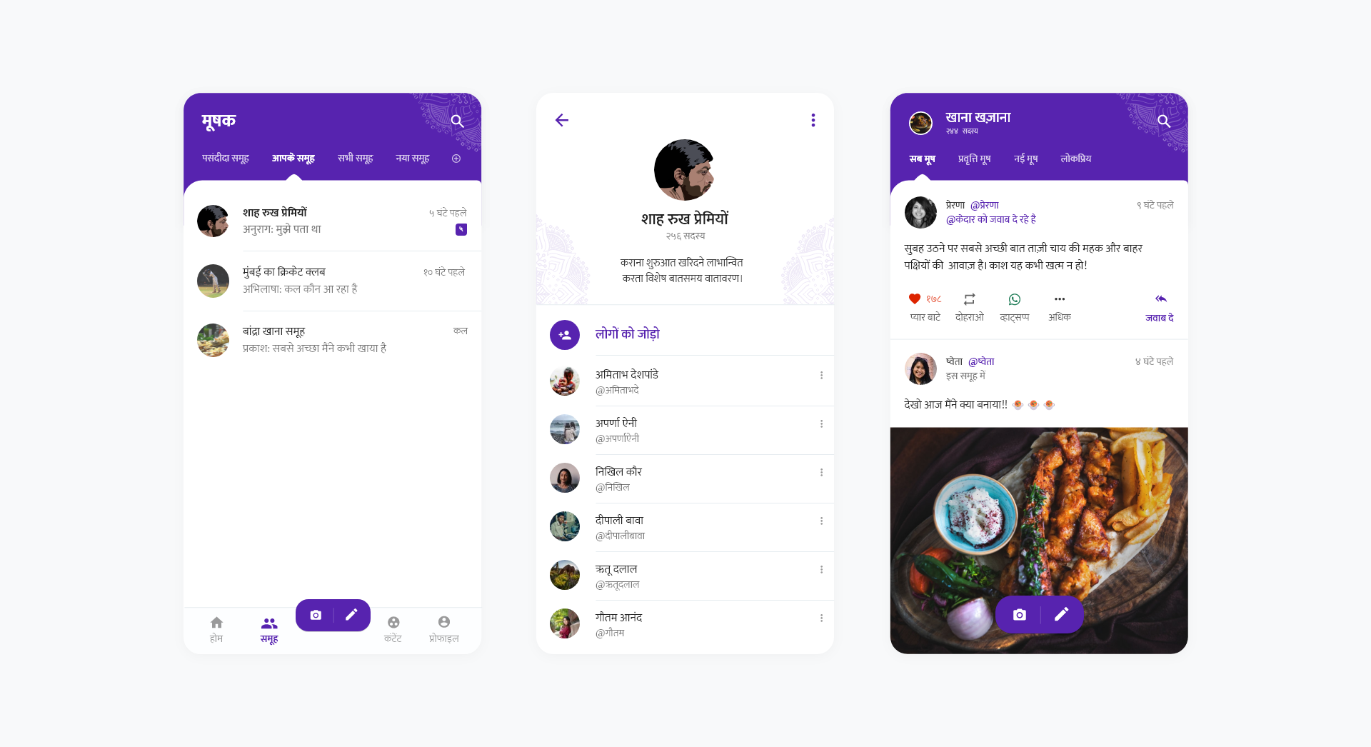 Groups were core to the app, and an end goal for most user journeys
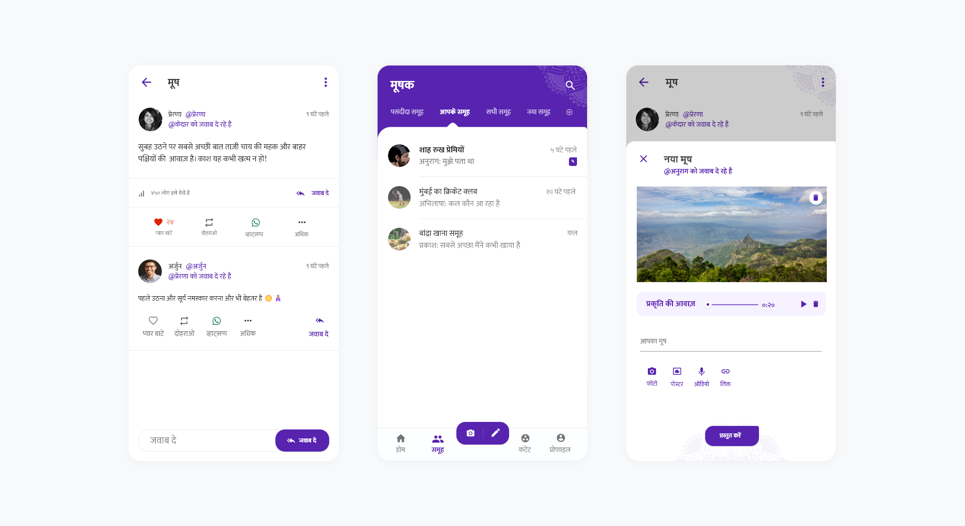 Mooshak’s feature set empowered creation, and beat the 9:1 creator-viewer ratio
Impact
Mooshak’s redesign was well met by its stakeholders as well as its consumers. The team behind the product was satisfied with the redesign, since it brought the product up to the market standard and overhauled the UX to draw consumers in towards key product features. Consumers were also vocal about the simplified presentation of groups, notifications and the ease of post creation.
Takeaways
My biggest takeaways from the project, though it has since been sunset, were dealing with selective perception and choice supportive biases, as well as building for a product that had already been scaled. Each decision had to be carefully weighed, and each change was conscious, deliberate and only marginally redefined, keeping in mind the learning curve that people had already overcome upon initial adoption.